
Redesigning The Intrinsic Perspective
How to make Substacks look good

For a long time, if you Googled “how to get subscribers on substack,” an old essay of mine would crop up, advising aspiring Substackers to find a cohesive aesthetic. Originally written years ago to celebrate TIP passing 2,000 subscribers, thanks to being so high in the Google rankings for so long, I do think that essay had a beautifying effect on this platform—in fact, I know of at least one prominent Substacker who credits it with inspiring their own design (not to mention the sky-high use of gold as a link color).
Substack is a more serious medium now, and 2,000 subscribers isn’t exactly the big leagues anymore.
Regularly, new media ventures launch here on platform rather than as websites of their own. Most recently, The Argument, self-described as a proudly liberal newsletter, debuted earlier this week with $4 million in funding. Everyone wants to talk about how it recruited a star-studded cast of writers like Matthew Yglesias, and why (or if) liberal magazines get better funding than conservative ones, and what a $20 million evaluation of a Substack can possibly be based on, and so on.
But I want to talk about how The Argument started off with a lime green background.

Now, immediately they bent the knee and changed it (although I only saw one complaint on their Welcome post). I wish they’d kept the lime green. At least a little longer, just to see. It was distinct as all get out, and for in-your-face political argumentation, works a lot better than the “we are very serious people” salmon underbelly it’s now in a toe-to-toe fight with The Financial Times over. A magazine like The Argument revolves around screenshots of the titles being shared (or hate-shared) on X, and when you are hit with a sudden burst of acidic lime in the timeline, like a pop of flavor, you’d have at least known what you’re reading. If your brand is in-your-face liberalism, then it makes sense to have an in-your-face color associated with that. Whoever made that initial (ahem, bold) design decision, and got later overruled, has my sympathy—I can see the vision. Almost taste it, actually. My point is that, lime green or not…
Aesthetics matter.
They define what you’re doing not just to others, but to yourself. TIP isn’t just what others are looking at, this is what I’m looking at all day, too. And now, closing in on 65,000 subscribers instead of 2,000, over the past few weeks I’ve set out to redesign TIP, starting with the homepage.
But to make decisions about aesthetics, you need to have a conception of self. This is probably the most significant and obvious failure mode: people are attracted to images, or visual vibes, but don’t themselves embody it. They can steal it, but can’t create it. You must be able to answer: What are you trying to do? Why are you doing it? What is this thing’s nature?
And over the years I’ve developed a clearer understanding of the nature of writing a newsletter, or at least, my kind of newsletter. The closest point of comparison I know of is a gallery tour of a museum. There’s a certain ambulatory nature to the whole thing. First you’re looking here, and then, somewhere else. Yes, there are common topics and themes and repetitions and so on, but the artistic effect is ultimately collective, rather than individual. I wanted to capture this tour-like atmosphere, so designed the new TIP homepage based around the idea of a literal gallery of images, hung inside a set of old painting frames. This is what it looks like now:

What I liked about my idea to use actual painting frames (these are cleaned up digital images of real frames) is that, much like an art gallery, a significant amount of white space gives each image, and its title, a chance to breathe. And when you go to click on a piece, it’s sort of like stepping into a painting.
To maintain this look, I’ll be picking out new images for each new post, but I get the additional fun of placing that image inside a chosen frame, of which I have a pre-established couple dozen saved and ready.
Meanwhile, the new Welcome page is a sort of infinite ladder I made with these frames: one inside the other, going on forever.

It reflects not only some classic TIP topics (remember when I argued that “Consciousness is a Gödel sentence in the language of science”), but also the structure of a newsletter itself, which sequentially progresses one step at a time (until death do us part).
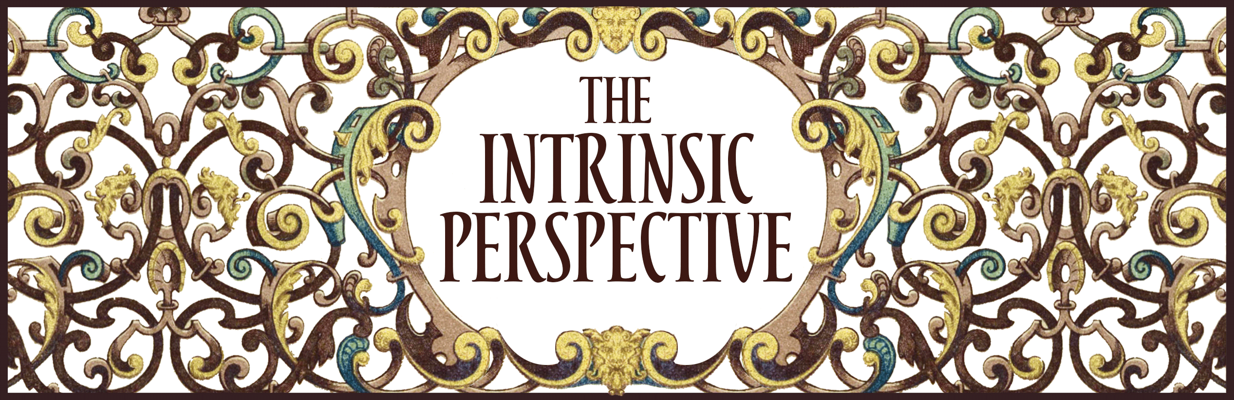
However, the “paintings” will be, at least for now, mostly reserved for the homepage and link previews. For the posts themselves that land in your inbox, they’ll often bear a new masthead. It’s what you saw at the top.
It’s created from a very old pattern I found, sometimes called rolwerk, which is a Renaissance technique. Again, there’s a lot of white space here, similar to a gallery. A masthead like this needs to not say too much—it is, after all, the lead for every single post, and so must span genres and moods, all without assumptions or implications. It must be in a flexible stance, much like how a judo expert or swordfighter plants their feet, able to move in one direction or another on a whim. It cannot overcommit.
Not to thwack you on the head with this, but I obviously picked out a lot of things from the Renaissance era for this redesign (many of the frames too).
Why?
Because centuries ago, before there was science, there was “natural philosophy.” It was before the world got split up by specialization, before industrialization and all the inter-departmental walls in universities got built. And yes, there was a certain amateurism to it all! That’s admitted. And there probably is here, too. At the same time, there’s a holistic aspect that feels important to TIP. It’s why I write about science, sure, but also lyric essays like The Lore of the World series (more soon!), and education treatises, and stuff on philosophy and metaphysics, and even occasionally pen a bit of fiction, and I wanted to capture that spirit with the designs here.
While I might try out using the “paintings” for header images in the future, I’ll be sticking to the masthead for now. I can’t help but feel that what’s arriving in your email should be stripped-down, easy to parse (and load). The design of a Substack needs to get out of the way of the writing, while still giving that little click of recognition about what you’re reading, and why, and preparing for the voice to come.
I think the new Intrinsic Perspective will be influenced by this choice. It may be a little less “here’s a huge centerpiece essay” and a little more “here’s something focused and fast.” Overall, a few less right hooks. A few more left jabs. I’m not talking about any major changes, just pointing out that the new design allows for a faster tempo and reactivity, and we all grow into our designs, in the end.
Of course, I’ll miss the old design. I was the first person on Substack (at least to my knowledge) to actually employ a resident artist who did the header images of every post. Let’s not forget or pass over how, for the past four years, TIP has been illustrated by the wonderful artist, Alexander Naughton. And he and I will still be collaborating together on some future projects, which you’ll hear more about (and see more about) early next year. But personally, I can’t help but be excited to have a more direct hand in making the homepage what it is, and getting to pick out images myself to make the new “paintings” with.
You can stop reading now if you don’t want to get too meta, but if you’re curious on what I recommend for Substacks in general, read on.
One reason for this extra section is simply that I’d prefer my idea for TIP’s new “museum-style” not be immediately stolen and replicated ad nauseam by other Substacks. And I do think you can apply some of the principles I used to come up with something different, but equally interesting. For advice on that, I’ll start with why, counterintuitively…